
Widget: Line chart
The Line chart widget shows how the metrics of a report change over time.
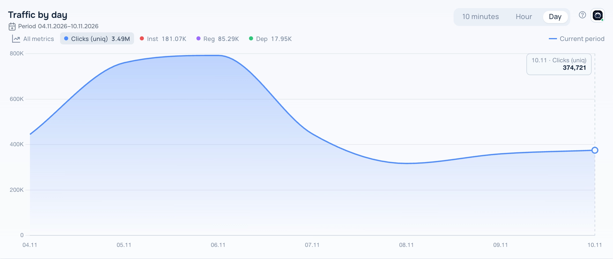
Line chart widget
What the report needs
A saved report with at least one metric and either no groupings or exactly one time grouping (10 minutes, hour, day and so on).
Views
The widget has several views. Switch the view in the widget header while the dashboard is in edit mode; the choice is saved with the dashboard.
Lines
One metric at a time as a filled line. Click a metric chip above the chart to switch, or All metrics to see every metric on one chart. If the report compares periods, the previous period is drawn as a dashed line.
Annotations
A filled area with the average line and marked peaks and dips.
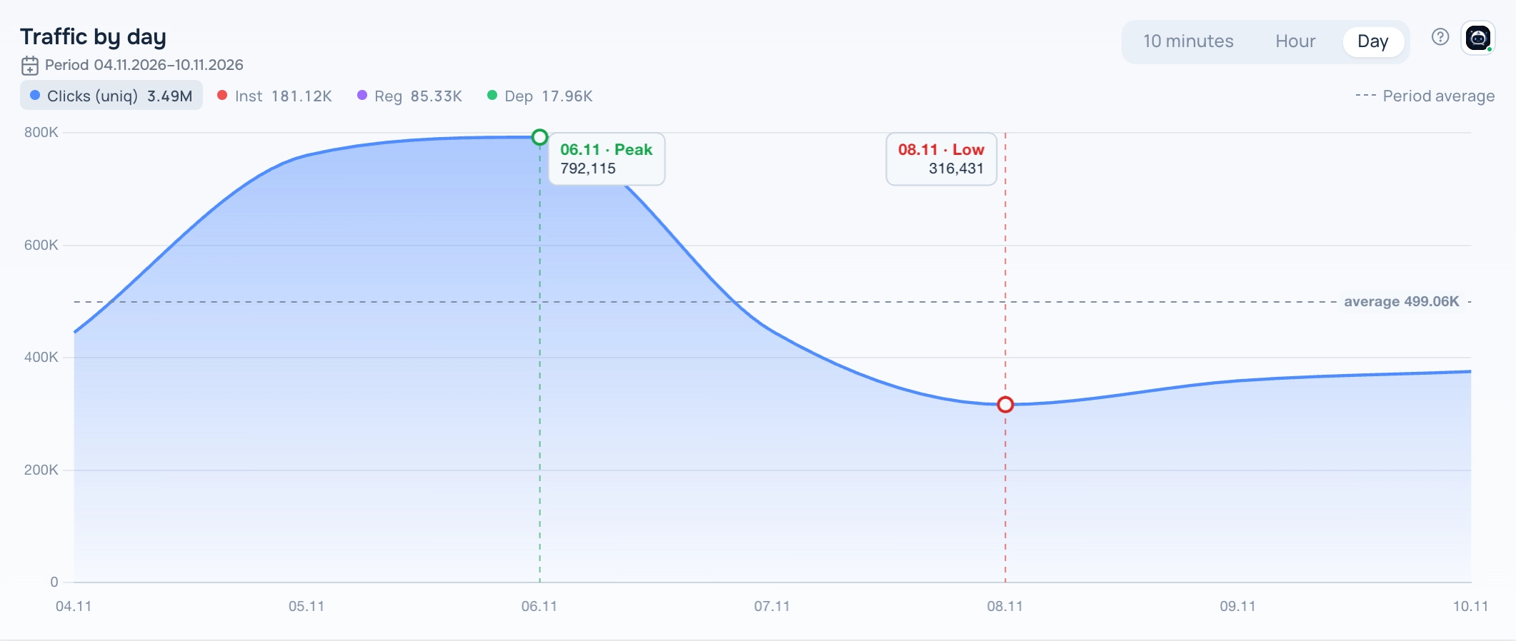
Line chart — Annotations view
Day overlay
One line per day by time of day, to compare days with each other.
Line chart — Day overlay view
How to add the widget
- Open Tracker → Dashboard, open the dashboard list and click the pencil icon next to your dashboard to enter edit mode.
- Click Add Widget and choose Line chart in Display type.
- Pick a report in Select saved report. The list shows only reports that fit this display type. If it is empty, create a report in Tracker → Reports first.
- Set the optional title, width and height, the main metric and the time step, then click Save.
- Click Save on the dashboard toolbar to keep the changes.
Settings
- Main metric — the metric selected when the widget opens.
- Time step — 10 minutes, hour or day. You can also switch it in the widget header at any time.
Period
The widget shows data for the period saved in its report; the caption under the title shows the dates. When you change the dates in the dashboard date selector, all widgets switch to the dashboard period.
Tips
- The selected metric and time step are saved in the widget.
- Hover over the chart to see the exact value of a point.
The ? button in the widget header opens this help article. The Adset AI button next to it opens the assistant with the widget context and ready-made questions about its data.